What is it about?
We will address various questions:
-
What do we mean by a use case?
-
Which use cases are discussed?
-
What can be seen in the graph?
-
Which aggregations are visible and why?
- Where do the data come from?
The digital application requires numerous measurement data that reveal behavior patterns? The application enables energy savings through feedback? The impacts of digital applications are complex and multifaceted due to their interactions. For example, resources and energy are needed to create and operate measurement technology, but more accurate measurement also allows for more personalized feedback to users or the precise detection of errors. Here, some of these interacting effects are to be collected and made understandable in terms of their impacts.
 Der Smart Readiness Indicator
The framework of the Smart Readiness Indicator, developed according to EU regulations to assess the intelligence capability of buildings, is used as the basis.
Within this framework, “Services” are defined, which are considered here as use cases.
The following aspects are considered:
-
Use Case: Describes the specific service being referenced and through which the effects/impacts are generated.
-
Impact Level: The levels to which the use case or action/implementation pertains.
-
Level: The gradations in the implementation of the use case.
-
Perspective: The areas affected by the implementation of the use case, such as economically, ecologically, from the user perspective, or the technical viewpoint.
-
Effect: The outcomes or intended effects associated with the implementation of the use case.
 „Reporting information regarding electricity consumption“
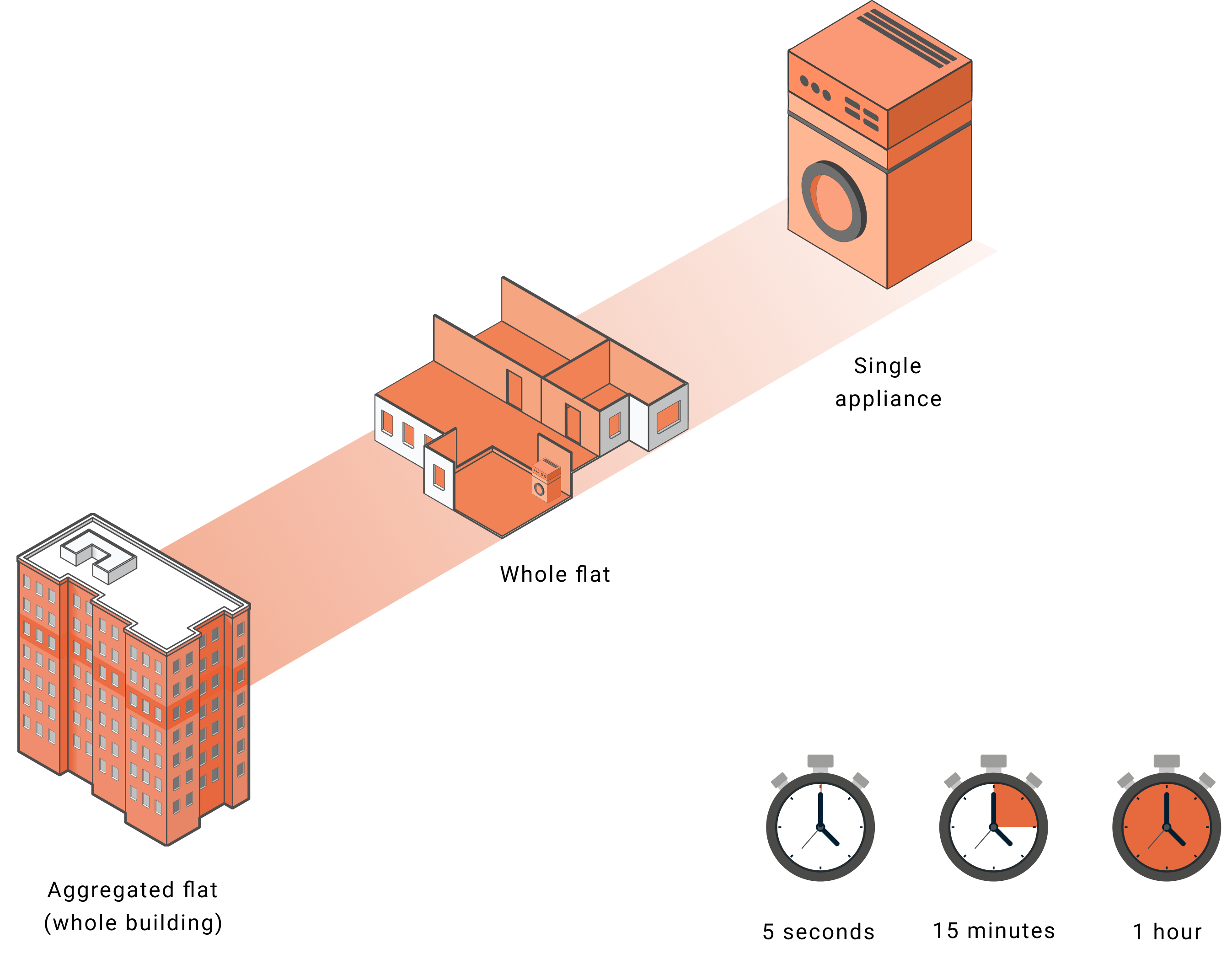
Displayed are the average consumption in time windows of five seconds, 15 minutes, and one hour, showing both the individual values of the households and the sum of the load profiles (three buildings).
The exemplary presentation illustrates how various aggregations (temporal and spatial) affect outcomes. High-frequency measurements make individual effects very visible, which may be lost in other aggregations. This aims to provide users with a quantitative and qualitative understanding of the effects of digitalization and their interactions. For example, resources and energy are required for the creation and operation of measurement technology,
but more precise measurements also enable more individualized feedback to users or detection of faults.
The goal is to uncover the various effects of digitalization and to demonstrate the interaction of different requirements. In doing so, we address various questions:
-
How does the frequency (5s, 15 minutes, 1 hour) affect the visibility of effects?
-
How do individual aggregations (facilities, total consumption, three buildings) affect the visibility of effects?
-
What can be seen in the graph?
Additional information:
SRI: Training SlTraining Slide Deckide Deck
IDEAL Datensatz: Pullinger et al., The IDEAL household energy dataset, electricity, gas, contextual sensor data and survey data for 255 UK homes, ci Data 2021 May 28;8(1):146. doi: 10.1038/s41597-021-00921-y.